Translucence

Yellow tulip back-lit to show detail of petals

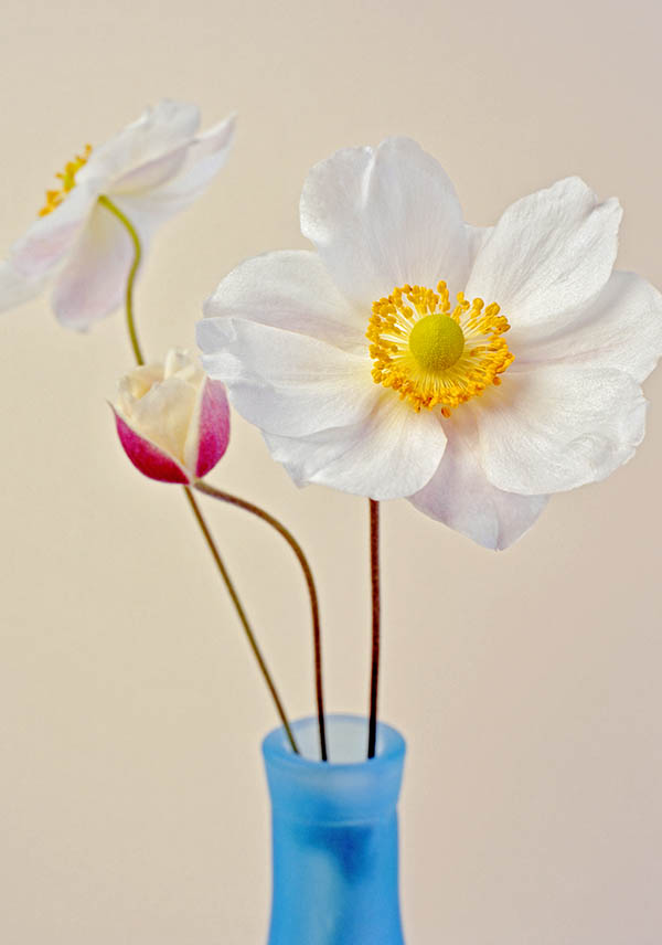
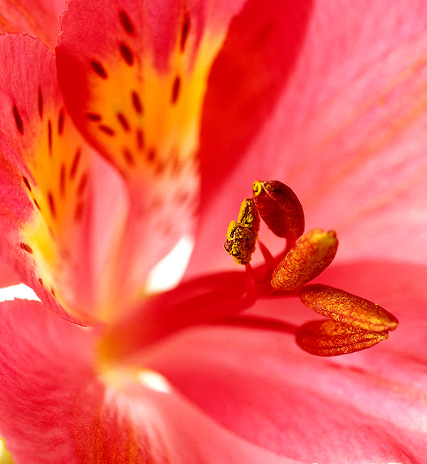
One of the ways I like to photograph flowers is to light them from behind. It brings out the translucent nature of the petals, allows the colour to glow, and shows up details that you wouldn’t see under normal front-lighting.

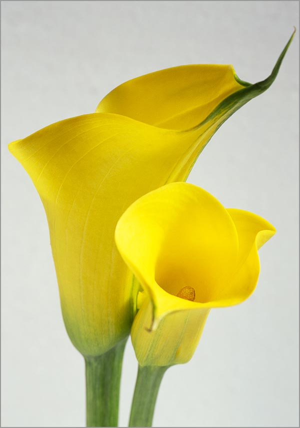
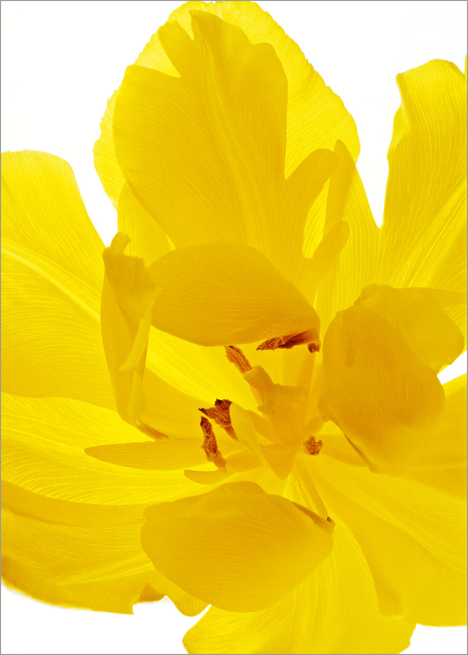
In the photograph of the yellow tulip above, I wanted to show the delicate lines of the veins in the petals. Without the back-lighting, they would have been pretty much invisible, but here, with the light coming through the petals, they are much easier to see.

The layering of the petals where they overlap one another creates areas of varying shade and this helps to give emphasis to the petals’ curving shapes. It also creates variations within the yellow of the tulip – more interesting, I think, than the flatter tones I’d have got if I had just lit the flower from the front.

Clematis lit to exaggerate the colour

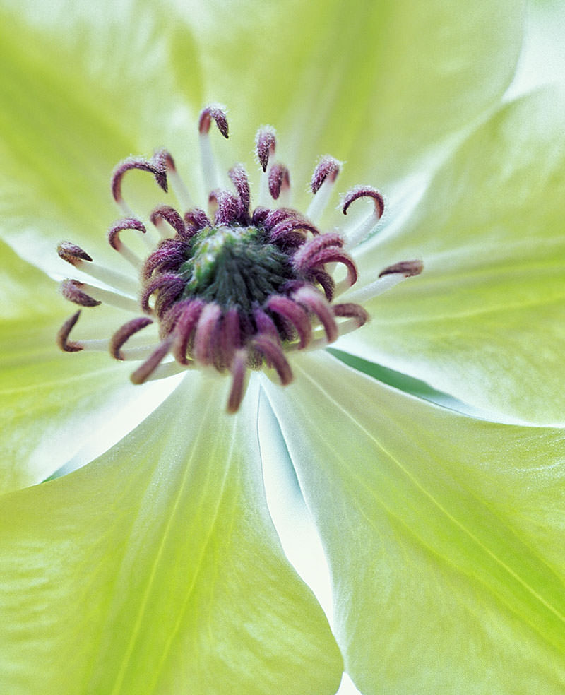
While the yellow tulip was photographed to give a realistic image, the green clematis above has had its colour exaggerated by the lighting and it was then saturated a bit more in Photoshop. If the flower petals are thick enough, the light from behind can make the colour appear richer. However, if you give this technique a try, you’ll find that the results will vary with the strength of the light coming through the petals and how much the petals themselves allow light to pass through. If you use a flower with very thin petals, the colour may become much lighter and you could instead create an image with very soft, delicate colours – a lovely effect.

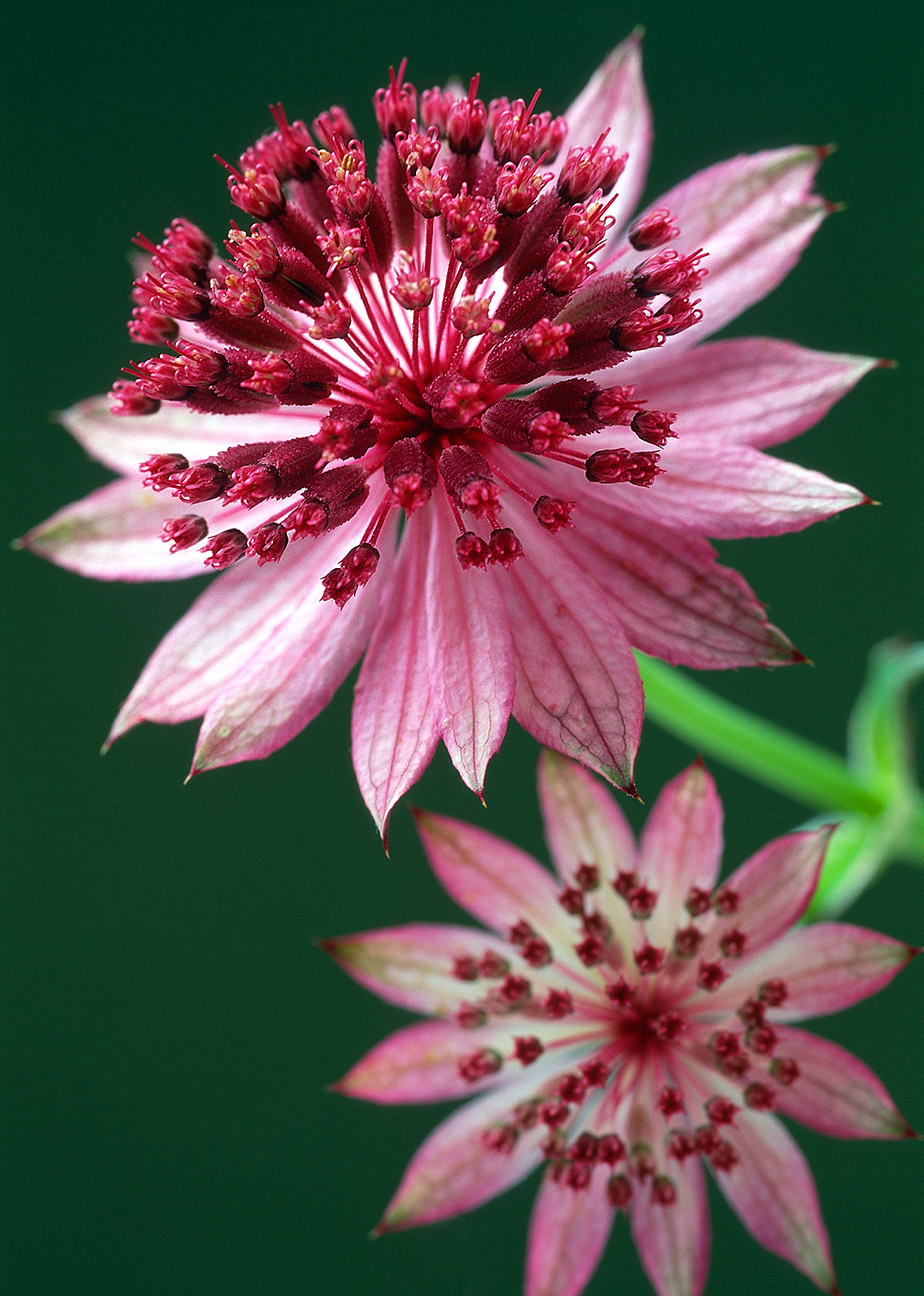
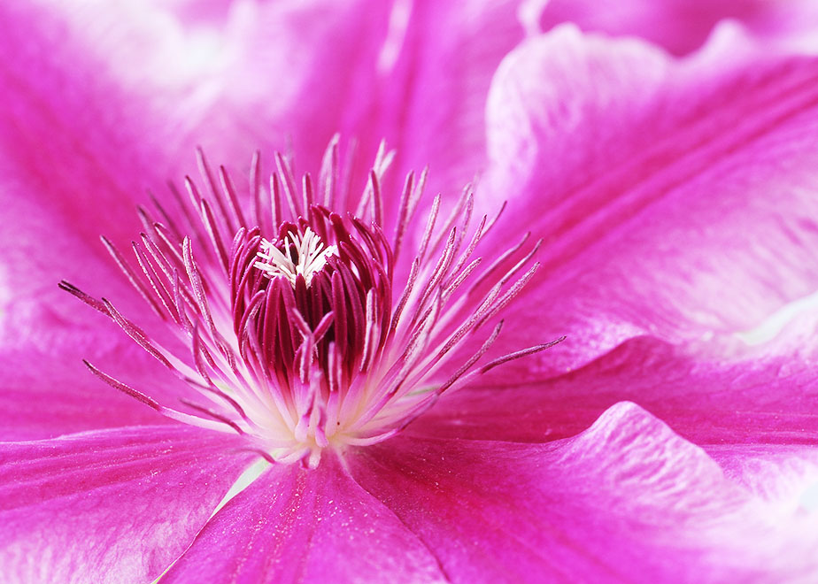
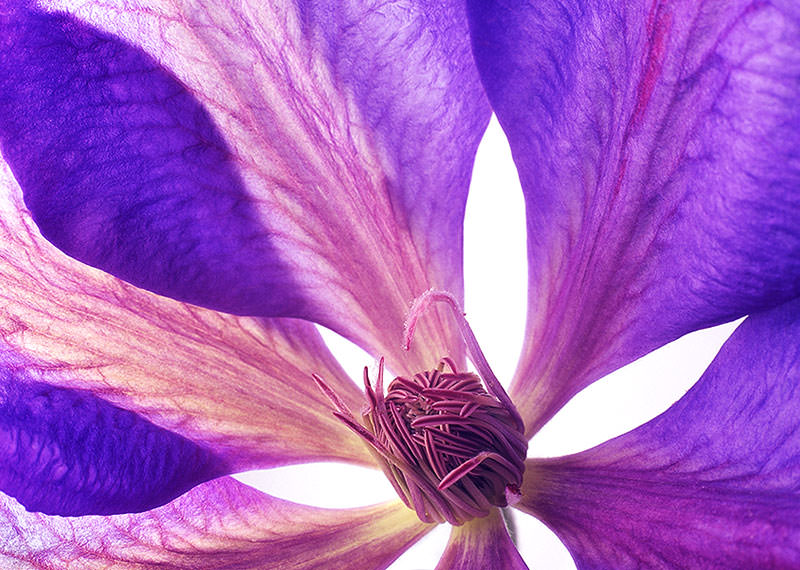
I can’t remember the name of the clematis below (this one grew in my garden in Scotland), but I hope I’ll find the same one again because these pinky-purply shades are among my favourite colours.

In this photograph, the petals on the left-hand side have the light coming through them from behind but the right-hand petals are lit from the front. That was because I wanted to light the centre of the flower to capture the detail there. As a result, the veins of the petals on the left show up very clearly, but the petals on the right have a much more solid appearance and you can see the slight magenta marking on the petal’s midrib.

Translucent purple clematis

A set-up like this is very easy to do if you can find a lightbox of the kind that’s used for viewing slides and negatives. These boxes have a translucent ‘opal’ top surface with daylight-balanced light tubes behind. All you have to do is lay your flowers on top and add some soft light to the front of the flower if you want to show the detail of the stamens etc. (Otherwise they would be likely to be in silhouette.) For the frontal lighting, you need to make sure that it isn’t too strong, otherwise it would drown the effect of the back-lighting. Soft, overcast light from a window would be the easiest thing to try.

If you try this back-lighting technique, remember to check that the light isn’t making your flowers hot and wilting them. You can always take them away from the lights in between shots, even give them a rest in some water for a while.

Comments are always very welcome – please feel free to add yours!

Variations on a Theme

Two white Japanese anemones in a bottle.

One of the good things about photographing flowers is that it’s fairly easy to come up with different images of your subject. (Much easier than having to hike miles around a landscape to find a different viewpoint.)

Variations of the image can be created while photographing or afterwards in the computer, using an image-editing program.

The top image (a version of the photograph below) has had textures added to it in Photoshop to give a softer, more romantic feel.

White Japanese anemones
The photograph as originally shot.

These ‘textures’ are simply photographs of a textured surface, usually with just one all-over colour but perhaps with a darkened edge and corners to give a vignette effect.

Photoshop makes it possible to stack the textured images above the original photograph and then to alter the opacity of the textured images. (Imagine looking through a stack of images printed on clear plastic – that gives some idea of how it works.) Controlling the opacity of the layers means that you can decide exactly how much of the textured layers show in your final image.

In this case, the textures I used were an image of a canvas weave and another of a lightly scratched surface. The opacity of the scratched surface was set very low, so that it hardly showed, while the canvas texture was set higher and made more visible.

If you decide to try out this ‘textures’ technique, there is another Photoshop tool that you’ll want to use – ‘Blend Modes’.

Blend Modes give control over how the different layers interact with each other. This tool can produce very subtle effects but it can also create something decidedly weird. Trying out the different settings is the best way to find out what they do. (And time can all too easily disappear as you play with all the possibilities…)

To prevent the details of the main flower from being obscured, I kept the textures off this area. This also removed the colour of the textures from the flower, so I added a plain pale yellow layer to unify the flower with the rest of the image.

(It would probably be simpler to just blur the textured area over the flower. This would remove the detail of the textures but allow the colour of the textured area to remain.)

After taking the first photograph, I decided to try something a bit bolder. This time I chose a very dark green background. Because very little light was hitting the background, it looks almost black and creates a strong contrast with the flowers.

White Japanese anemones against a dark background.
Same flowers (Japanese anemones), but a much more dramatic image.

For the second photograph, I changed the lighting to add to the contrast. (Both were lit with studio flash.)

The first photograph had been taken with a soft, well-diffused light (a softbox brought close to the flowers and a large reflector to the side). The result was to give a very even light with the reflector bouncing light back into the areas that would otherwise have been in shadow. This allowed the details in the petals to show and helped to give a gentle, delicate feel to the photograph.

To create the more contrasty lighting for the second photograph, I simply moved the light further away (and, of course, turned up the light output to make up for the increased distance). Moving a studio light further away creates a ‘harder’ light with stronger highlights and shadows. (Just think of how the sun creates such harsh shadows – it’s a very distant light source.)

Taking the reflector away also increased the contrast by removing the light that it would have bounced into the shadows. I think the end result is probably as far as I could push the contrast before I started to lose too much detail in the petals.

As with the first photograph, I decided to play around with textured layers to see what the effect would be. The result is much softer than the original photo and goes to show how different the image can become once you start experimenting with the different possibilities. I think there’s plenty to keep me busy for quite a while!

White Japanese anemones against teal background
The textured background creates a softer feel.

Red Hot

After such high temperatures recently, it seems appropriate to post some pictures that suggest summer heat.

It’s not often that I get the chance to photograph bright red or orange flowers. That’s a shame. really, because there’s nothing quite so bold and brilliant or downright fiery.

Red and yellow dahlia
Dahlia on fire – red and yellow petals look like little dancing flames.

Red is a colour that I’ve been a bit over-cautious with in the garden. There are some dark reds –  penstemons, clematis, and a scabious that likes to pop up everywhere. And there’s a nice little red potentilla too, but that hasn’t done very well this year.

An exception is the one very bright orangey-red oriental poppy that leans over the path to the greenhouse and all but grabs you by the ankle as you pass. There’s absolutely no ignoring it when it’s in flower but by August it feels like a distant memory.

There’s even less orange in the garden. (Though I now have a lovely clump of crocosmias that were given to me by a friend.)

Hot orange rose
A radiant rose, glowing in the summer sun.

The reason for the lack of hot colours here is that we had planted the garden up in softer colours to create a calm, peaceful atmosphere. (Or maybe just a place to have a sneaky snooze in the shade…)

Now it’s time to wake things up a bit with a touch of heat. Time to be a bit more adventurous. (And I’d really like the opportunity to photograph more bold, zingy, hot-summer flowers….of course I would!)

What are your favourite bold flowers? Any red or orange ones that you especially like? Planting ideas and suggestions are very welcome in the comments. (And I love an excuse to go to a garden centre!)

Red alstroemeria
You can almost feel the heat from this alstroemeria.

Rain At Last!

Japanese anemone 'September Charm'

It’s never been so good to see rain. We’re in Suffolk in the UK and this summer has been hotter and drier than any I’ve experienced before.

With record-breaking temperatures and no rain for many weeks, gardeners here have been frantically watering and worrying about whether their gardens would survive.

Somehow we’ve been lucky. Only a few of the plants in our garden have been badly affected.

One of these is the Japanese anemone ‘September Charm’. (Despite its name, it always starts to flower here by the end of July and finishes in August.) This year’s flowers are smaller and some of the leaves are wilting. But I haven’t watered it because it’s a rampant thug and I’m trying to discourage it from spreading everywhere. (Despite its ambitions to take over, it can stay because it’s a good subject to photograph.)

Another plant which is struggling, even though I water it, is a lovely blue veronica. I really hope it survives because the slim spires of flower work so well as a contrast to the other plant shapes in the border.

A careful eye is kept on our one bush hydrangea and so far it’s doing quite well, with just the occasional watering. (Bath-time for the tiny frogs that are living under it at the moment!) It might not be the most suitable plant for our hot, dry garden but I had to have it – the lacecap flowers are lovely to photograph.

(There are also a couple of climbing hydrangeas, but I never water them and they seem to do just fine.)

Many other plants have coped well with the drought. A hibiscus (‘Blue Bird’) has had very infrequent watering. (I have a sneaky dodge here. I’ve pushed a length of plastic pipe into the ground beside the rootball. Watering into the pipe means that the water is carried right down deep to the roots.)

Hibiscus 'Blue Bird' flower
Hibiscus ‘Blue Bird’ has flowered well this year.

Other happy plants include a number of trees and shrubs. (The mature ones seem to have had no problems.) I’ve been particularly impressed by a purple smoke bush, ceanothus, dark-leaved elders (‘Black Lace’ and ‘Black Beauty’), a Himalayan indigo and a cut-leaf lilac (Syringa x laciniata), all of which are still relatively young and have had no watering at all this summer.

Many of the smaller plants that have done well (agapanthus, sedums, salvias, gaura, Russian sage, Anthemis tinctoria, stipa tenuissima) were chosen after reading ‘Beth Chatto’s Gravel Garden’. This is a tremendously useful book which takes you season-by-season through everything you need to know about creating a garden that will survive drought and I can really recommend it.

Have you any tips for keeping a garden going through drought conditions? Any ideas, suggestions for good plants etc. would be very welcome in the comments…

Blue agapanthus flowers
Agapanthus has done well despite the drought.

Sunny Yellows

I don’t have a lot of yellow in my garden.

There’s some – we have a winter-flowering jasmine and following that there are the spring bulbs. (A few crocuses, lots more daffodils and some bright yellow tulips that have probably been in the garden for many years.)

Later, as different flowers open, the garden turns largely lilac, pink, and blue. There are also lots of deep reds, bronzes and browns. These darker shades could seem a bit sombre, so a touch of yellow in summer enlivens the whole garden.

The richest and most intense of the yellows in the garden here is the rudbekia. It’s a plant that I’ve lost in the past because it prefers a moist soil and our rainfall in this part of the UK (Suffolk) is very low. During the drought this year, I’m having to keep it well-watered. Fingers crossed that this one will survive!

Easier yellows have included a potentilla and the little daisy flowers of Anthemis tinctoria ‘E. C. Buxton’, both of which have produced a mass of flowers over a long period. Easier still is the evening primrose, because it self-seeds generously and just pops up wherever it feels like it. It’s a delight to come across the unexpected pale gleam of its flowers as night begins to fall.

Another easy way to add some yellow is to simply buy a few plants in pots. I’ve done this when I’ve spotted something I want to photograph. (Oh, that happens a lot!)

yellow chrysanthemum with water drops
Chrysanthemum grown in a pot to photograph

The daisy flowers of chrysanthemums and the elegant flowers of calla lilies are inviting subjects to photograph. And the yellow of the flowers here makes a change from the pinks, blues and purples that I more often have available for my photography.

yellow calla lilies
I enjoy photographing calla lilies

For the future, there’s a yellow flower that I’d like to grow here that will be the cause of a lot more work than any of the others. A waterlily. (Of course, I like to photograph waterlilies in other colours too.)

First, I’m going to have to build a pond….but that’s a project for the autumn and early winter because the ground is now rock hard. (We haven’t had a drop of rain in many weeks and there’s none forecast for the next couple of weeks either.)

I think the work will be well worth it, though. (But my back will probably disagree!) For I do love pond plants, especially waterlilies.

yellow waterlily
I saved my favourite for last!

I hope you enjoyed this little bit of sunshine!

Astrantia – A Pretty Flower With An Intriguing Past

In last week’s post, I said that a flower’s structure is one of the main things that makes me want to photograph it.

Astrantias are a good example of this. The shapes created by the outer ruff of petal-like bracts and the inner ‘pincushion’ of tiny flowers make it irresistible to me and my camera.

The astrantia flower offers plenty of detail to photograph. The inner pincushion of flowers has stamens that are like little threads. Just behind each minute flower is a ribbed part that looks like a miniature corn-cob – this will eventually become the seed.

Behind the flowers, the papery bracts are delicately veined with pink or green. Choosing to either bring these veins into sharp focus or to let them blur softly into the background allows for a different feel to the resulting photograph. To take advantage of this, I usually make a series of photographs. Experimenting with different depths of focus and photographing from varied angles is a very pleasant way to spend a morning and it’s ever so easy for time to just pass me by…

The shape of the astrantia flower has given it one of it’s common names – ‘Hattie’s Pincushion’. Who Hattie was, I have absolutely no idea. But it’s a sweet little flower to have as the last trace of her memory.

Astrantia’s other common name is ‘Masterwort’ and it’s this name that you find in historical references.

As ‘Masterwort’, astrantia was believed to have a number of medicinal uses. In ‘Culpeper’s Complete Herbal’, Nicholas Culpeper describes many ways that it could help his patients.

Maladies ranged from ‘all cold griefs and diseases, both of the stomach and body’, to cleansing and healing wounds, and preventing rheumatism and gout. Culpeper also suggests that it should be taken with wine to ‘extract much water and phlegm from the brain, purging and easing it from what oppresses it’.

However, I really wouldn’t recommend trying astrantia as a remedy for any of the ills that Culpeper mentions. His herbal was completed in 1653 and medicine has changed a bit since then!

Nowadays, being ‘a pretty face’ is quite enough for astrantia. It has become popular with garden designers and is easy to grow. Since astrantias prefer moist soil, I find that I need to keep them watered in my dry Suffolk garden. But they grow happily in shade and mix beautifully with other plants. (I think they’d look great combined with grasses, so I plan to try them with Stipa tenuissima next year.) For many gardeners, perhaps the best thing about astrantias is that slugs don’t seem to eat them. Yes, a plant that’s pretty much slug-proof – how wonderful!

Pink astrantia
Astrantias can be pink, red or white.

A Photographer’s Garden

As both a photographer and a gardener, obviously I tend to choose plants that I think will make a good photograph. The flowers I choose are often fairly large with a complex structure or interesting markings – something to hold the interest of the viewer.

It probably won’t take you long to spot my favourites on this blog. Passionflowers, hellebores, clematis, tulips and alliums are just a few of the flowers that give me the urge to grab my camera. (And, um, a strong urge to visit garden centres too!)

Buying plants to photograph means that I’ll have plenty of subjects for pictures. But buying one each of these plants won’t add up to good garden design. Instead, if I don’t restrain my plant-hunting, I’ll end up with a very bitty-looking garden.

Of course, the remedy is simple. We’re told to plant in groups of three or five, or in drifts if we’re lucky enough to have the space. Yeah, fine! That just gets a bit expensive at the garden centre….

Luckily, lots of the plants I’ve chosen are easy to propagate or else like to spread or seed themselves about. These plants are gradually becoming the backbone of my garden and they make it look a bit more cohesive.

There’s a snag here though. (There would be!) Some plants are getting just a bit too enthusiastic. Tall red scabious are getting absolutely everywhere, the geraniums are ruthlessly trying to smother the young astrantia plants nearby, and Japanese anemones are doing their best to take over the entire garden.

It appears that this photographer’s garden is going to be a constant balancing act. (And some of the more thuggish plants will have to be forced to mind their manners. That may take quite a bit of effort on my part.)

I hope you have the chance to enjoy a garden in this wonderful weather.

My Favourite Source of Inspiration

garden border in summer

I’ve always loved gardens. Early morning in summer is the best time in mine. It’s still peaceful then, and the demands of the day can be ignored for a little while.

Part of what makes it feel so special to me is the quality of the light at that time of day. It hasn’t yet got the bright glare that it will have later on. Instead, the light slants into the garden, picking out the textures of soft, feathery grass heads and glowing through the translucent petals of flowers. It brings a feeling of joy.

I’m certainly not an expert gardener, so it feels like a small miracle when plants grow well. (Especially if they haven’t had the care they should!) Self-seeded ”babies” are an excitement and sometimes a mystery…

sweet pea and aster flowers
Sweet peas and asters grown for a photograph

There are failures too, and there are always plenty of weeds, but somehow the garden always feels like a place of hope.

From childhood, I’ve been attracted by the look of plants. Not just for their colours, but for their textures and their structures too. (Think of the velvety petals of a petunia or of almost metallic-looking Allium christophii flowers.)

As I’ve grown older, my interest has widened to include the history of plants, the folklore, the stories told about them. (In general the relationship between man and plants. Probably because, for me, it represents the link between ourselves and nature. Because we are a part of nature too.)

There you have it – I’m a plant nut! (And always will be.) And yes, you may have found me out – photographing plants makes an excellent excuse for buying more!

clematis flower close-up
One of my favourites – a clematis