
One of the good things about photographing flowers is that it’s fairly easy to come up with different images of your subject. (Much easier than having to hike miles around a landscape to find a different viewpoint.)
Variations of the image can be created while photographing or afterwards in the computer, using an image-editing program.
The top image (a version of the photograph below) has had textures added to it in Photoshop to give a softer, more romantic feel.
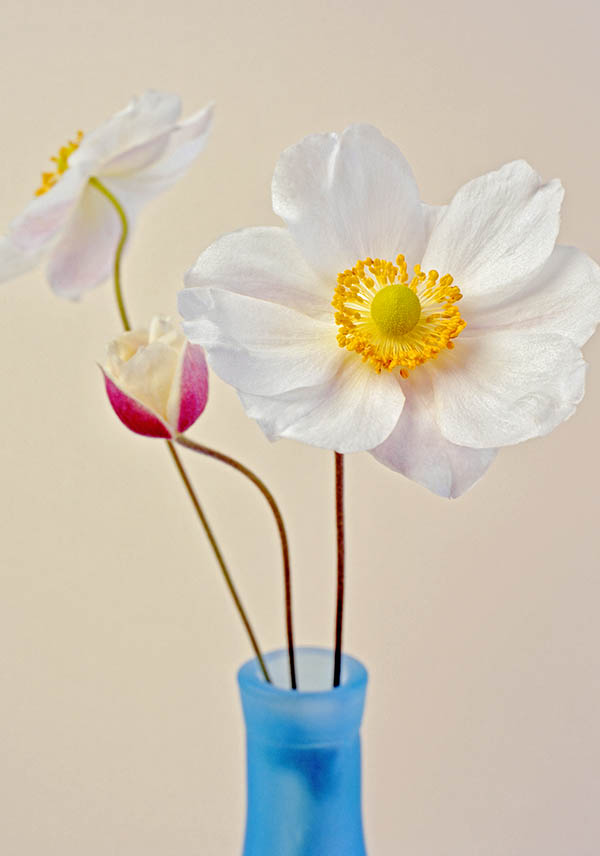
These ‘textures’ are simply photographs of a textured surface, usually with just one all-over colour but perhaps with a darkened edge and corners to give a vignette effect.
Photoshop makes it possible to stack the textured images above the original photograph and then to alter the opacity of the textured images. (Imagine looking through a stack of images printed on clear plastic – that gives some idea of how it works.) Controlling the opacity of the layers means that you can decide exactly how much of the textured layers show in your final image.
In this case, the textures I used were an image of a canvas weave and another of a lightly scratched surface. The opacity of the scratched surface was set very low, so that it hardly showed, while the canvas texture was set higher and made more visible.
If you decide to try out this ‘textures’ technique, there is another Photoshop tool that you’ll want to use – ‘Blend Modes’.
Blend Modes give control over how the different layers interact with each other. This tool can produce very subtle effects but it can also create something decidedly weird. Trying out the different settings is the best way to find out what they do. (And time can all too easily disappear as you play with all the possibilities…)
To prevent the details of the main flower from being obscured, I kept the textures off this area. This also removed the colour of the textures from the flower, so I added a plain pale yellow layer to unify the flower with the rest of the image.
(It would probably be simpler to just blur the textured area over the flower. This would remove the detail of the textures but allow the colour of the textured area to remain.)
After taking the first photograph, I decided to try something a bit bolder. This time I chose a very dark green background. Because very little light was hitting the background, it looks almost black and creates a strong contrast with the flowers.
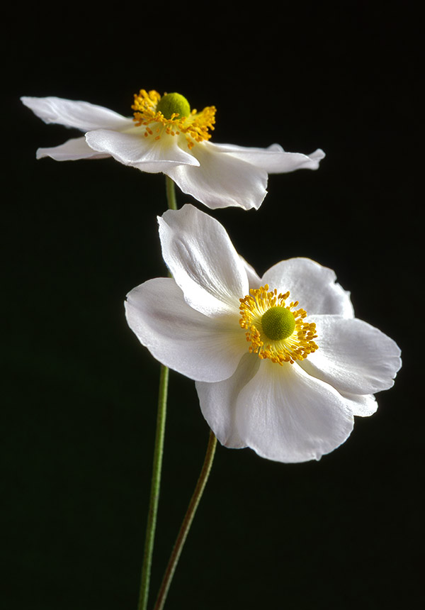
For the second photograph, I changed the lighting to add to the contrast. (Both were lit with studio flash.)
The first photograph had been taken with a soft, well-diffused light (a softbox brought close to the flowers and a large reflector to the side). The result was to give a very even light with the reflector bouncing light back into the areas that would otherwise have been in shadow. This allowed the details in the petals to show and helped to give a gentle, delicate feel to the photograph.
To create the more contrasty lighting for the second photograph, I simply moved the light further away (and, of course, turned up the light output to make up for the increased distance). Moving a studio light further away creates a ‘harder’ light with stronger highlights and shadows. (Just think of how the sun creates such harsh shadows – it’s a very distant light source.)
Taking the reflector away also increased the contrast by removing the light that it would have bounced into the shadows. I think the end result is probably as far as I could push the contrast before I started to lose too much detail in the petals.
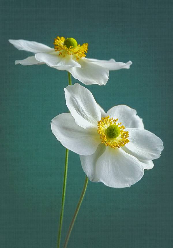
As with the first photograph, I decided to play around with textured layers to see what the effect would be. The result is much softer than the original photo and goes to show how different the image can become once you start experimenting with the different possibilities. I think there’s plenty to keep me busy for quite a while!

I really like the results you got with the first one!
LikeLike
I appreciate your comment, thank you!
It’s quite fun to see how the photo changes with the added textures – I reckon I’ve lot more of these that I’d like to try!
LikeLiked by 1 person
These are beautiful pictures! Thank you for sharing them. I like your style.
LikeLiked by 1 person
Thank you Shelly! I’ve been enjoying your blog so I’m delighted that you’ve enjoyed this! 🙂
LikeLike