One of the ways I like to photograph flowers is to light them from behind. It brings out the translucent nature of the petals, allows the colour to glow, and shows up details that you wouldn’t see under normal front-lighting.
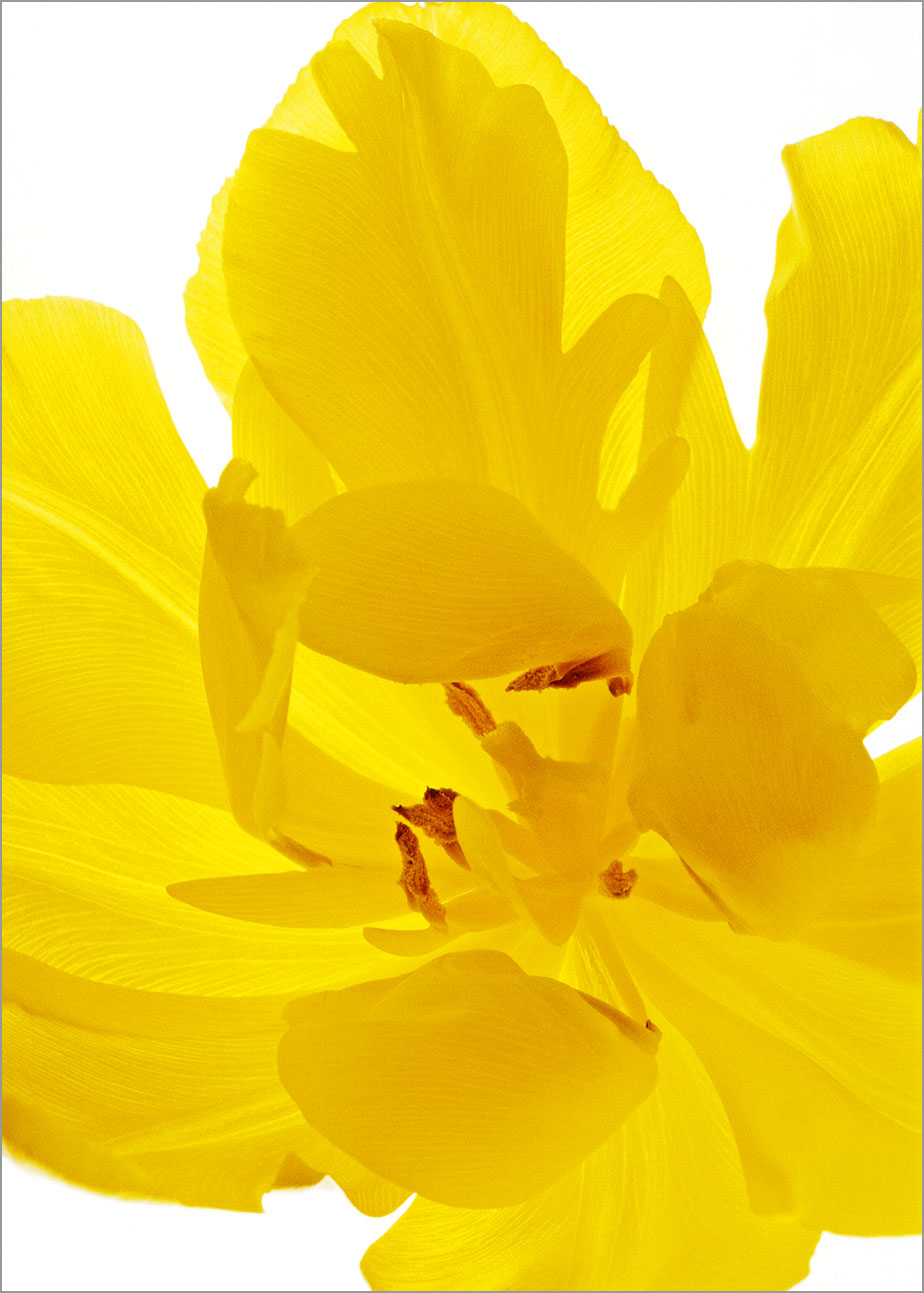
In the photograph of the yellow tulip above, I wanted to show the delicate lines of the veins in the petals. Without the back-lighting, they would have been pretty much invisible, but here, with the light coming through the petals, they are much easier to see.
The layering of the petals where they overlap one another creates areas of varying shade and this helps to give emphasis to the petals’ curving shapes. It also creates variations within the yellow of the tulip – more interesting, I think, than the flatter tones I’d have got if I had just lit the flower from the front.
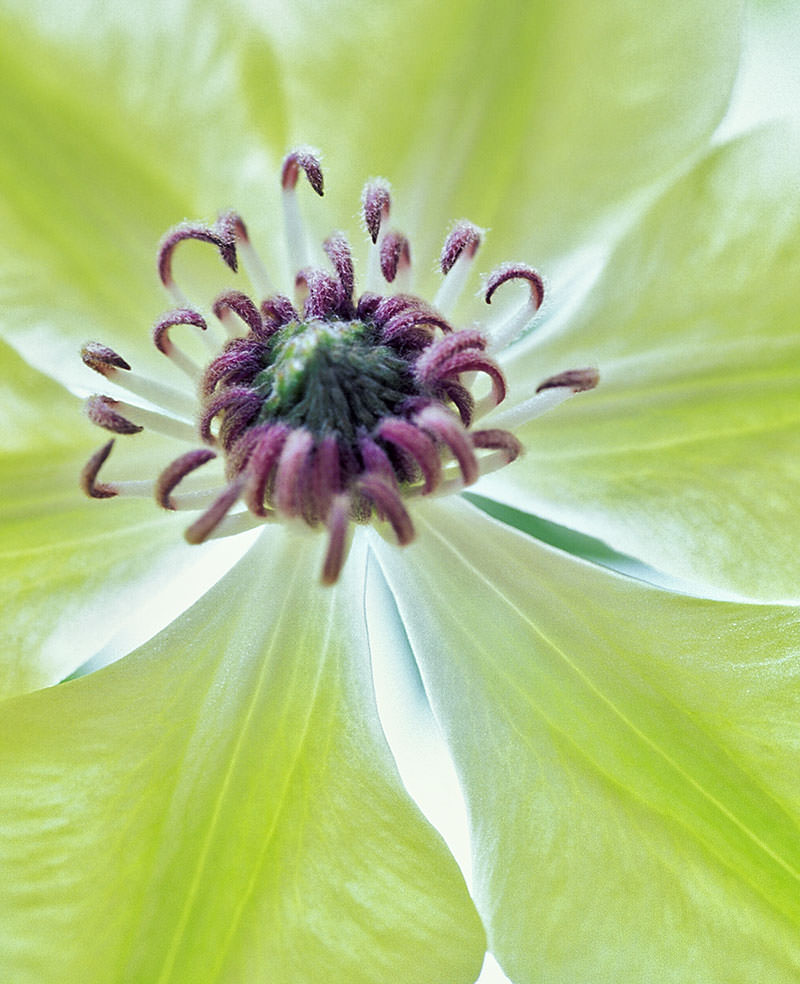
While the yellow tulip was photographed to give a realistic image, the green clematis above has had its colour exaggerated by the lighting and it was then saturated a bit more in Photoshop. If the flower petals are thick enough, the light from behind can make the colour appear richer. However, if you give this technique a try, you’ll find that the results will vary with the strength of the light coming through the petals and how much the petals themselves allow light to pass through. If you use a flower with very thin petals, the colour may become much lighter and you could instead create an image with very soft, delicate colours – a lovely effect.
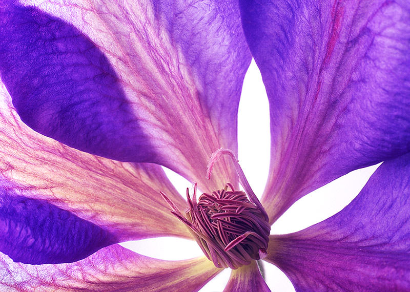
I can’t remember the name of the clematis below (this one grew in my garden in Scotland), but I hope I’ll find the same one again because these pinky-purply shades are among my favourite colours.
In this photograph, the petals on the left-hand side have the light coming through them from behind but the right-hand petals are lit from the front. That was because I wanted to light the centre of the flower to capture the detail there. As a result, the veins of the petals on the left show up very clearly, but the petals on the right have a much more solid appearance and you can see the slight magenta marking on the petal’s midrib.
A set-up like this is very easy to do if you can find a lightbox of the kind that’s used for viewing slides and negatives. These boxes have a translucent ‘opal’ top surface with daylight-balanced light tubes behind. All you have to do is lay your flowers on top and add some soft light to the front of the flower if you want to show the detail of the stamens etc. (Otherwise they would be likely to be in silhouette.) For the frontal lighting, you need to make sure that it isn’t too strong, otherwise it would drown the effect of the back-lighting. Soft, overcast light from a window would be the easiest thing to try.
If you try this back-lighting technique, remember to check that the light isn’t making your flowers hot and wilting them. You can always take them away from the lights in between shots, even give them a rest in some water for a while.
Comments are always very welcome – please feel free to add yours!

Lovely Ann! You might be interested in my reblog of an article by Harold Davis which also includes links back to his own blog site: https://exploringcolour.wordpress.com/2017/11/14/harold-davis-constructing-an-image-from-the-materials-of-nature/ I know he’s been doing some very beautiful work more recently too but I haven’t been keeping up with it.
LikeLiked by 1 person
I’ve just been to read that and the earlier article – fascinating thoughts on the role of art and maybe an idea for a future blog post…. Thank you Liz!
LikeLiked by 1 person
You’re welcome Ann, I thought you might enjoy what he’d shared.
LikeLiked by 1 person
I did! I actually have his ‘The Photoshop Darkroom 2 ‘ but haven’t had time to read much of it yet. It is very good so far! Davis does some very complex work and I’m hoping to learn some of these techniques…….
LikeLiked by 1 person
That’s fabulous to hear Ann, exciting!
LikeLiked by 1 person
Very nice makros! I like your pictures!
LikeLiked by 1 person
Thank you! I’m very happy that you like them! 🙂
LikeLiked by 1 person
I love this close up exploration of these flowers! Thank you, Ann. These pictures are gorgeous.
LikeLiked by 1 person
Thank you Shelly! I’m very glad that you enjoyed the photographs. 🙂
LikeLiked by 1 person
These photos are beautiful Ann! Translucence is my favorite aspect of watercolour. It’s an amazing concept in photography too.
LikeLiked by 1 person
Hi Laurel! Thank you! 🙂 Yes, I love translucence in both photography and painting. (It’s one of the things that makes me want to make collages – the translucence of layers of glazes…….mmmm! And watercolours – oh my, I love the way the colours can layer or how the white of the paper can make them seem lit from within.
LikeLike
These are beautiful images!
LikeLiked by 1 person
Thank you for your lovely comment – you’ve made my morning happy! 🙂
LikeLike
Stunning photographs. Thank you for sharing.
LikeLiked by 1 person
Thank you Hermione! I love to photograph flowers this way – glad you enjoyed them! 🙂
LikeLike