As a photographer, I’m very aware of the difference that light makes to flower colour. The pictures on this post are both of the same rose ‘Rhapsody in Blue’, but you can see how the light has changed the way the colours appear.
The top photograph was taken in the evening, at a time when the sinking sun was creating a warm golden glow over everything. This has made the flower petals look much more magenta. Their red and pink tones have been picked out by the warm light.
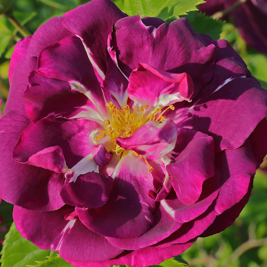
The second photograph has been taken nearer the middle of the day. (On a day which has been just overcast enough to soften the shadows which might otherwise have been very harsh.) See how much more purple there is in the petals in this light. That’s because the light is more neutral, allowing the flower’s real colour to show.
If I had taken the second photograph on a day with heavy cloud, I would probably have got stronger blue tones in the flower. (And more yet if I had chosen to photograph during ‘blue hour’ before dawn or after sunset – but that’s getting a bit dark for my purposes!)
Exploring how changes in light affect colours is all part of the interest of garden photography. But right now, after a very grey few weeks, I’m grateful for every bit of bright sunshine we get. The last few days have been hot and sunny and it feels as if summer has returned to us. I only wish it would last a little longer!


One of my top favourites in the Gore Gardens rose garden. Your 2nd photo is really nice and just how I think of it (even though the appearance varies according to light as you’ve discussed). Thanks Ann!
LikeLiked by 1 person
Thanks Liz! It’s a rose I really like, especially for that velvety purple. 🙂
LikeLiked by 1 person
Great study in your garden, Sue! Beautiful pictures too!!
LikeLiked by 1 person
Thank you Indira – I enjoy having this rose in my garden. 🙂
LikeLiked by 1 person
Sorry….Ann🙃
LikeLiked by 1 person
Hehe! 🙂
LikeLike
It’s a beautiful colour, though definitely not blue in any light!
LikeLiked by 1 person
Agreed! This really isn’t anywhere near a blue – just a bit of rose-breeders’ salesmanship there! (Or wishful thinking!)
LikeLiked by 1 person
Light certainly does make a difference. Beyond that, I’ve learned that camera sensors and monitors can make any individual photo look quite different to different people. Thinking about it, I have the most trouble with yellow. Photos can often appear far more orangeish than in real life; it’s a real trick for me to get the color right.
LikeLiked by 1 person
I agree, cameras and especially monitors do make a huge difference. With all these factors, it’s a wonder that our images look anything like their real colours! I often wonder about how my photographs may look on other people’s monitors. I do calibrate my own, but the monitors their seen on will have the final say in that! For me, I have to watch that greens don’t get more saturated than the other colours – but then, a lot will also depend on what people are used to seeing. Complicated! 🙂
LikeLike
Interesting blog title Ann! I notice this all the time when playing in PS how the color of a subject can change depending on how you shade or lighten areas of it, so I can see this is really true with different light settings in your garden. It is rather amazing! Beautiful photos BTW!
LikeLiked by 1 person
Even just looking at the garden, without taking photographs, it’s really interesting to see how the colours can change with the light. (And the details that the light will pick up at different times.) All good reason to enjoy some time just sitting in the garden and watching how things change. 🙂
LikeLiked by 1 person
Two nice illustrations of the difference light temperature can make in a subject’s color.
LikeLiked by 1 person
Thanks Steve! As you’ll be well aware, it’s one of the interesting things for a photographer… 🙂
LikeLiked by 1 person
I love the darker version with the petals looking velvety.
LikeLiked by 1 person
That’s the one I prefer too. 🙂
LikeLiked by 1 person