
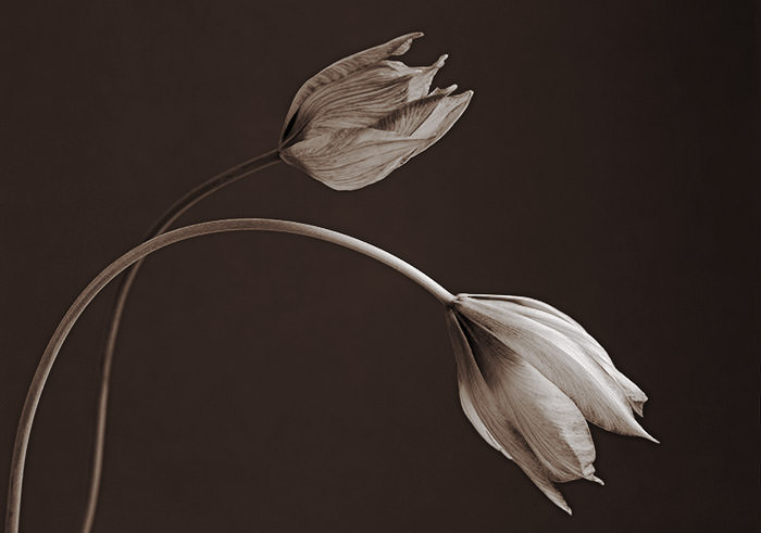
Sometimes I prefer the look of a photograph that has been converted to black and white, rather than the original colour version. And it can be even better if it has had some ‘toning’ added in Photoshop.
So why should that be? For some photographs, it may simply be that the original colours don’t work well together – as with the ‘Spider Lily’ above. The flower was growing in front of our house, which is painted ‘Suffolk Pink’. I didn’t like the pink wall as a background because it distracted from the flower too much.
Converting the picture to plain black and white got rid of the distraction but the result wasn’t terribly exciting, so the colour tones were added to create a bit of extra interest. This has given a look very like a cyanotype print which has been toned in tea. (Does that sound odd? Ordinary tea makes a great toner for cyanotype prints – takes the harshness out of the blue and turns the white paper a soft cream/brown shade.)
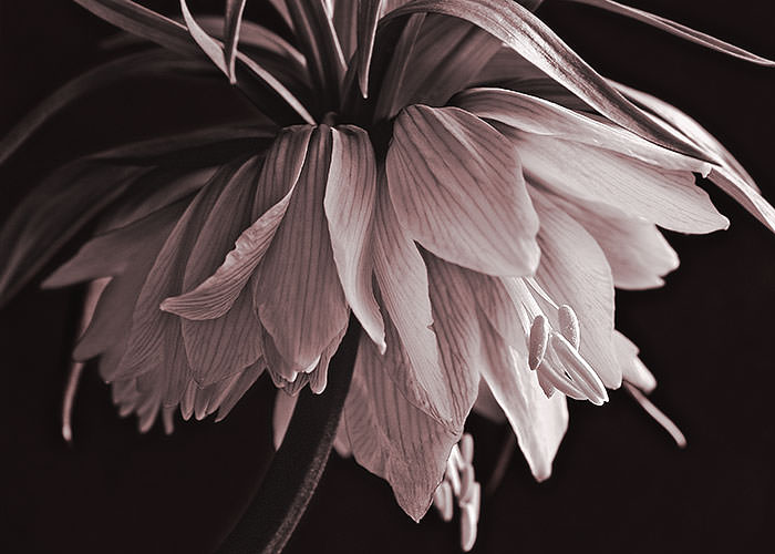
Other photographs may benefit from simplification. With the ‘Crown Imperials’ above, I was attracted by the lines of the veins on the petals, and to a lesser extent, by the way the curve of one of the leaves at the top echoes the curve of the petals below it. But in the original, the orange of the flower and the green leaves that contrasted with it competed too much for attention. Here, with the image as a monochrome, your eye can more easily follow the lines along the petals.
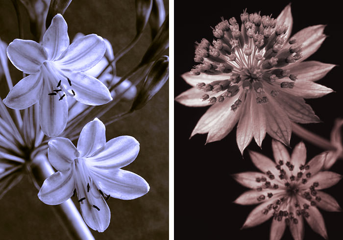
Both of the photographs below worked well in colour but the blue and brown duotone of the agapanthus and the warm pinky-brown monochrome of the astrantia give the images a new life. They have become something entirely different from the photographs I started with. (You can see the original colour photograph of the astrantia here. )
I think that the toned versions of the photographs work because their subjects no longer look as they do in nature. Without their normal colouring, the flowers are somehow unfamiliar. Because of this, they are able to be seen in a different way. Now there is a possibility that you may notice new details or simply react with feelings that the original colour versions wouldn’t have inspired.
It’s very satisfying to experiment with photographs in this way. There can be a restfulness, even an elegance, to the restricted colours in the final image.
If you fancy trying this on your own photographs, you’ll find that it’s not hard to do if you have an image-editing program. Photoshop, for instance, allows you to convert the photograph to black and white. You can then alter the colour in any way you like, using the ‘Colour Balance’ adjustment on the shadows, midtones and highlights or you can try the more complex controls available in the ‘Curves’ commands. (I should think that there are other possibilities with newer versions of Photoshop than mine.) And, of course, there are many other monochrome effects out there that you can try. You could have hours of fun with these!

Ann, I really enjoyed this post. Your images are superb and it was interesting for me to see what you’d done with the Crown Imperial given I’d posted a photo with those in, in my Reds and Yellows post. Your artistic take on this flower is outstanding, its so elegant and so interesting! I’d be very pleased to reblog this in its entirety on my blog if you allowed me to do so – its very relevant to my theme of colour! If you’d like me to then let me know, I’d make it very clear that its yours and link back. If you don’t want me to, there’s no need to get back as I’d never do anything without your say-so.
LikeLiked by 1 person
Hi Liz! Thank you for the lovely compliments! I’d be happy for you to reblog the post but I have a suggestion…. Google apparently penalises websites that duplicate content, which wouldn’t be good for either of us, so why not just quote part of the post. Maybe quote the paragraphs you want with a few words of your own in between , e.g. ‘Ann goes on to talk about…’ so that the content is a bit different. That way our SEO will be OK!
LikeLiked by 2 people
That’s very nice of you Ann. I would introduce you at the beginning anyway, and as you’ve already suggested I can add in some other variations. I’ll try to do it this week, in a few days time.
LikeLike
That’s great Liz! And the variations will hopefully get Google to see it as something different rather than repeated content. 🙂
LikeLiked by 1 person
I was mulling it over and have decided to feature your first two images and the associated content and provide a link to your post that readers can follow to see the rest. It will make a very nice post thanks Ann 🙂
LikeLiked by 1 person
Sounds good – I look forward to seeing it!
LikeLiked by 1 person
Really loved the spider lily image and the blog was very interesting too!
LikeLiked by 1 person
Thank you! I’m glad you liked it. The spider lily photograph really didn’t work in colour, so it was a relief that the duotone improved it!
LikeLike
[…] Read the rest of Ann’s post at Monochrome (and Duotone) Magic […]
LikeLike